What was once popular then tossed aside seems to always come back years later. Designers in many fields seem to be taking cues from the ‘90s once again. Websites are taking cues from early internet design and brutalist architecture meanwhile JNCO baggy jeans are being manufactured again. Now we aren’t suggesting you go out and try to live like it’s 1995, but perhaps taking a second look might not be so bad. Hindsight is 20/20 and fresh eyes tend to find untried ideas. What we are seeing in interior design is a return to ‘90s colour staples like emerald/hunter green. The use of tropical plants are even making a return. Not all is what it seems though. This is part 1 in a 2 part series looking designs created by people bringing the return of ‘90s design.
Use of Hunter Green, Gold and Patterns from The Mid 1990s is Overkill
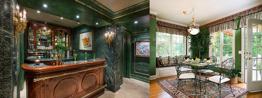
These two rooms from the mid ‘90s aren’t just in love with deep rich greens or even patterns, they are in love with the word ‘more’. Patterns are everywhere, intricate metal and wood work is everywhere. If that isn’t enough the overall imposing nature of this ‘more-ness’ is an overt assault on all senses. You don’t know where to look next, and you are left feeling small and unimportant. Needless to say the rooms are gaudy.
Bold Use of Hunter Green and Gold Without The Over-stimulation Seen Today
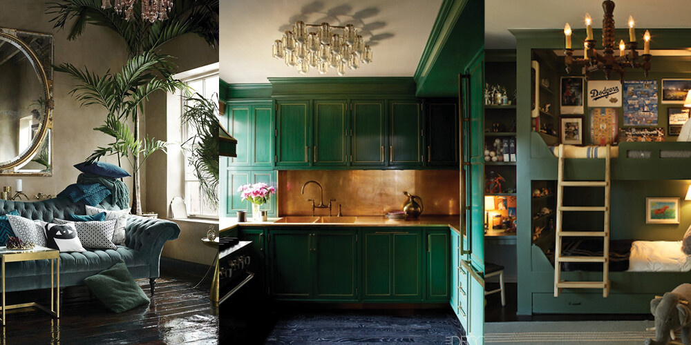
Looking at the two images above, we can see the designers chose the repetition in pairing hunter green with gold like years past. Both modern takes are bold, warm and retain some of the imposing nature. What is different however, is outright omission of patterns. Hunter green with gold commands attention. There is no need to continue to highlight how bold of a design these are. Without the patterns, you can then breath again without feeling assaulted on all senses. These are spaces that are imposing but not gaudy.
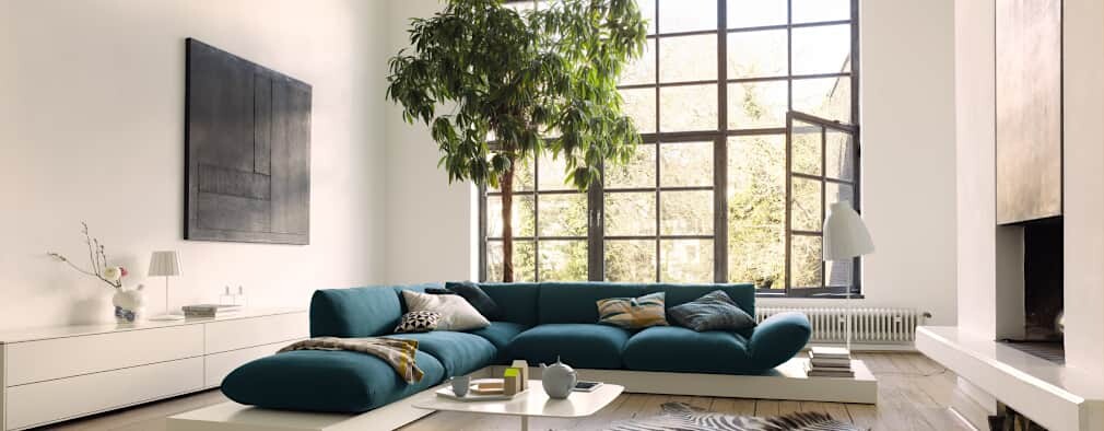
We tend to stick with earth tones such as real rock or wood grain. Earth tones ground you in a contemporary space. Start with a strong wood grain contrasted with white rock as your base textures. These textures can be paired with a strong sense of green, so perhaps some large leafed plants or a tropical patterned backsplash. Accenting the room with a chair or an object that has an interesting geometric shape is a great form of past/present contrast. The key is to always consider what should and should not grab your attention when you step into a room. So instead of re-imagining your best years in the ‘90s, let VictorEric add flourishes of nostalgia but keep you firmly in the present.